London based Post-graduate with a passion for games and game design!
Showing posts with label sketches. Show all posts

6 Apr 2016

New Eden Mobile: Alien Animals

As the story behind New Eden is that it was a space ship from earth, I thought a way to include the earth element is to comind normal animals to make alien like ones. I wanted to make a flying one and a big cat/dog type one, but due to time testritiones i desided to just make the flinging one. The aniames I wanted to combined where a bird and a bat. This is so it could be easily recognisable, and the bat like parts will help make it look more dangerous.
I tried different ways to combined them, but I mainly wanted to keep it simple to both fit the look of the game, and make modelling and rigging quicker. 


When colouring the bat bird, I wanted it too look thretaning to a player by looking at it, so I tried to use scehems that envocke danger. The coloures I used where based off a poisonis plaint, a dragon/lizerd, a bee and for the last one I wanted it too look more alien so I used constasting colours and waired patterning. I liked the colours of the plant one most, but I desided to go with the alien one to show the game is based on a nother planet. However, I didn't like the colouers as much as it started to blend in with the enviroment of the level. So I tied out diffrent colour combanations. I when with a perpaly pink one in the end, as the rednnes made it look more dagorose, and it stood out from the greens of the level.
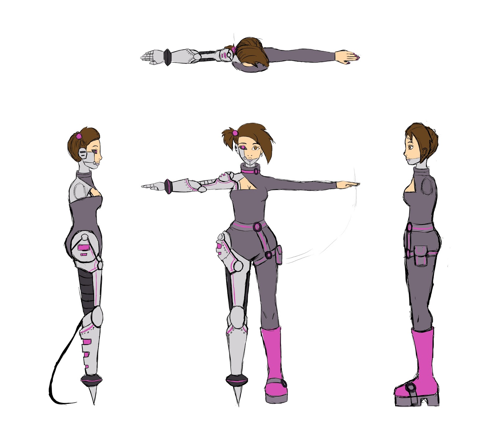
As I was still working on the grope project at this time, I desided to keep the enamies as sprites so I woden't have to model them. This helped me save time, but also keep to the ristricked poly count, as the character was more then ezspected.


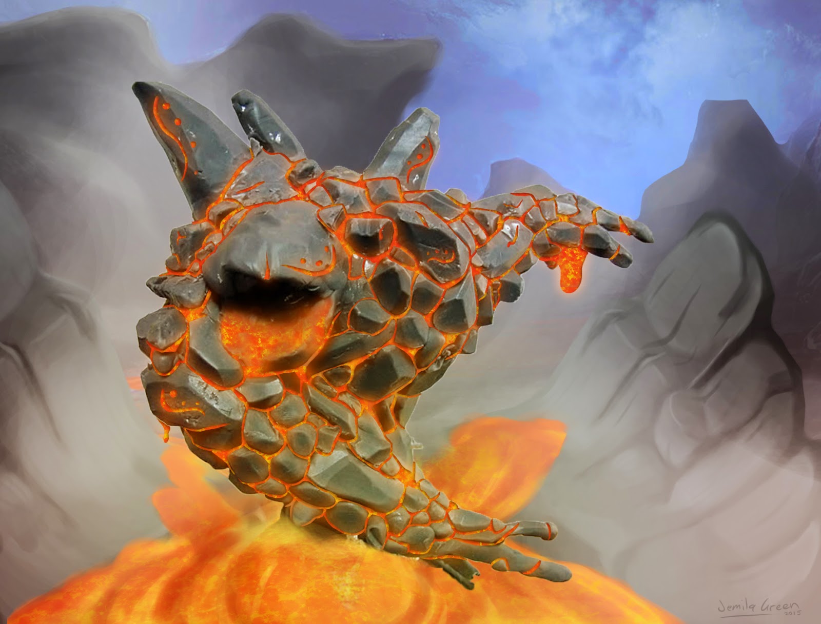
Even thogh I didn't have time to make the tiger hedhog, I still wanted to use it for the title screen of the game. I had a lot of troble getting the body to look right, so I used the zsphere tool in ZBrush to quickly block out the shape I wanted. This helped me to pose the creature.


At first, I wanted to give this creaure a strange colour scheem like the bird bat, but it started to look to bizzare and didn't seem to fit into the world of the game. Because of this, I kept the colours ferly simple, and focised on giving it feacures that make it look alien insted.
My fist try at doing this creates wasen't so good as I tried to use the gray schale and overlay tecnque that I used for the bird. I wasen't really getting the blend of coloures right and I started to over complicat the forms. So I started again, this time making sure I kept it simple and saturated, so it matched the styling of the game.


15 Feb 2016

New Eden Mobile: Sketch Book Studies


To understand what assets I have to make, I started by drawing out some level designs for the game. At first I thought about making an endless runner, but that seemed quite boring, and I wanted the stelf element of the PC version to included in the mobile one. I then tried out some normal side stroller ideas, but this still felt too far different and ganeric I then thought of a platformer that works more like a puzzle game, in that the player would have to try and avoid enamys and use the environment to reach the goal. I also did some skeches of diffrent cartoony styles for the character. I wanted it to be much smaller and more simple the the PC version so it would take less polys and be easier to model.


Once I had modeled the character, I did some sketches of the kind of poses I wanted to her to be in. This helped me to see where the joints needed to be when posing it in Maya.
I also started designing the enamies. I wanted one to be some form of big cat or wolf, and the other be a flying animal. I wanted all the animles to look alien, so show the game isn't based on earth, so I tried to mash different animals together.


I wanted there to be somthing for Tarrin to colect at the end of each stange as the goal, so I drew up some madalian designs as this fit the Aztec theme of the world. I thought it would be boring to colecty the same thing each level, so i thoght of braking it apart and having the player collect all the peases. This give the game more of a goal and naritive.

26 Mar 2015

Steam Punk GunBlade Design


For my steam punk design, I didn't want to do a character as I already did that for my robot design. So I decided to make a gun again, as my last gun wasn't that grate.


21 Mar 2015

Lights Out! Concept Art


For our Games Encounters project, we have to make a flaying, shooting game. We decided to make a wire frame, data like game as it would make it easier to texture and model. I made a mood bourd just so I could get an idea of what we wanted this game to look like.

I made some basic designs for our main character, Proto and some enamnys. We wanted Proto to be a antivirus code that kills the enemy viruses. We wanted to use round, smooth shapes for proto to show hes friendly and good. I also made him look yonge to give him a feeling of inexperience. We also wanted to make the main bad guy Proto's older brother, an antivirus code gone wrong. So by making him look younger, he gives off more of a little brother feeling.
With the enamys I just tried using different shapes and colours to get different looks.


I also did some level concepts to get a better understanding of the game. This is when I realized the problem with the colours. As out game has no textures and it just black and colour, we had a very limited pallet we could actually work with. I also noticed that it was hard to make out the enamys from the background when there's to many colours.  


This was a sketch of what we wanted the menu to look like.

18 Mar 2015

Anthropomorphic Frog Design


I always have a little trouble at the start of the design posses as I need to narrow down what I want to design before I can think of what to draw. In the end, I decided to make a gypsy girl as I think the colours of the exotic frogs would make well with the multiple colours and patterns of gypsy clothes. 


In the end, I chose a green frog, as I think the colours will make her more recognisable as a frog. But I made sure it also had other colours so I could make her design more interesting. 


I like the design of my final frog, but I don't like the way I painted her. I think the way I did the legs make her look a little of balance. I also had trouble panting the waves in her skirt, so she starts to look flat in that aria. 

12 Feb 2015

Painting Lava


In this lesson we had to put lava into the cracks of this rock monster. I used a lava texture as well as inner and outer glow effects to get the lava to look more realistic. I also used a inner shadow to make the lava really look like its inside the crakes. The hardiest part of this was doing the background. I'm not so good at composition and I haven't done a lot of backgrounds before. I used refrances and overlayed them with basic colours to block out some of the rocks. I also looked at tutorials so I could make my own rocks for the foreground. They took up most of my time as I keep starting again. I also tried using the colours from the rock monster when painting the rocks, so that they look like they're from the same environment. Once done I added a fog effects to separate the monster from the background, as he started to disrepair a little. 


We then designed our own lava rock creatures. At first I wanted to do something human like, but as I do that a lot, I decided to make something more animalistic, as I don't draw animals a lot.


Out of my fist sketches I liked the aquatic idea the best as I liked the idea of something swimming in lava. I spent a lot of time trying to get the rocks to look like rocks, which I think I did pretty well. But again, my composition I think wasn't that good. I was going to put in a lava background, but because of the position I draw him in, nothing really worked.  I also think I should have put his tail behind him so the focus would be more on his face.