London based Post-graduate with a passion for games and game design!
Showing posts with label maya. Show all posts

14 Mar 2017

KittyKABOOM Enemy Conpects

Munchers

I desided to go for robot enemies insted of organic ones, as they would be easier to animate and model. I also thought that the player shooting a real living creatures could seem more violent then intended. I also wanted to use the same shapes and look of the queen to influence the robots. At first I tried making a mouse tank type vehicle to fit in with the cat tank. But as the code I used was based on a zombie  enemies, the enemy needed to look like they would deal out damage in a slimier fation. I did a drill like design as the spinning would be easy to animate, but then I changed it to an "eating" robot, as it was already sapost to resemble a mouse, and mice has mouths, not drills. So visually this made more sence. 


I also desided to make a simple/crude test model so I could get a better understanding of what this robot would look like in 3D. I also needed it so I could see what the design would look like in the orthographic view of the game. 


Doing this helped me to see that I had to pay special attention to the ears as from an angle they may not read as ears at all. I kept this in mind when making the actual model and made the ears extra big so that they can be clearly seen in game. This dose make them look strange in a front view but it helps them to be seen diagonally. 


Cages and Cats

At first I wanted to make some cats as colectables for the game, but then I desided to change them from collectibles to objectives as it makes more sence with the goal of the game. I also made this change as I was having a hard time trying to deside what the boss section of the level would be like. Having one big turret was too easy and boring, so at first wanted it to be some form of big mouse robot with different kinds of ammunition that the player would have to avoid wile trying to attack it. Though this would have been more entertaining, I didn't have the know how to do this, or the time to lean how to eather. Because of this I had to think of a simpler way to make the boss section more engaging without having to add much. As there is a round about in the boss section, I thought that I should have some turrets curcel around it, as this would be easy to implement and the addition of a moving target could be fun. I then also desided to make the turrets cages that have the cats inside to make the player feel more determind to fight them.

I desided to use the same cat model for each cat, even though they all look different in the consent. This is because it will be easier to add more cats this way in the future, and as the wont be very big on the screan, the player might not even notice the differences if I was to model them. I changed the faces of the cats in the texture as adding the bigger cat eyes didn't translate well. 


Even thought at this point the art style of the game had changed to the lined toon look, I still did a panted concept fro the cage as I find it easier to paint non organic things, specially when I'm not sure what they look like. I made sure to keep to yhe same shapes and colours as the other mice related things to make so it all looked cohesive.



28 Feb 2017

KittyKABOOM Level Design


To crate the environment for the level, I first took a birds eye view screen shot of the grey box and ternt it into a template for the modelling proses. I new I wanted the first level to be on the street where Margret lives, to show that the mice have taken over and the after math of that. When doing the concepts for this, I had a hard time trying to draw what this normal street would look like which aliens taking over. As environment art is my weakest aria, I really strugled with trying to produse something that I was happy with quality wise. I desied to simply finish the normal street, then work on modaling the other assets so tha tI could try dressing the street in Unity and Maya. 


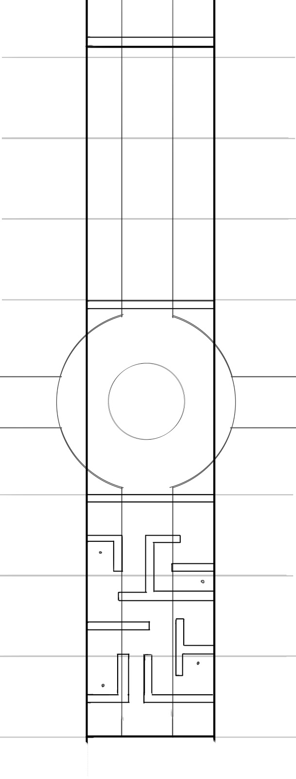
To make sure the modled environment mached that of the gray box, I took a birds eye screen shot of it then drew a map over it in Photoshop. I then used this as the template for modeling the level. At first, I was going to make the maze part out of different things from the steeet that had been knocked over or crashed into to form the shape of the maze. I wanted to do this to show how the people had goten into panic once the mice invaded. However, after modeling the assets, I realized that making the maze in this way looked very disorganized and nonsensical. Specially as the player would be in a tank, so realistically they could just run over thses things. So insted I desdied to change it to a maze that the mice set up to stop people from running about freely. It would also reflect the motif of putting mice in to mazes.


To deside what the  walls for the maze should look like, I started with some quick sketchs, but then thought to be would easier and quicker to try modeling different versions as a way of consepting them insted. This really helped as I could see what they will look like all around as well as hopw meny polys each design will take. Once I had designed on a design, I used this to make the maze and other barrias that the Mice had put up.


When texering anything for this game, I made sure that the colors are a little duller then intened, as the toon shadier make everything much more saturated in game. I moved the round about to the boss aria as it made more sence for the larger space to be for the bigger fight. At first, I thoght I was going to put the boss at the center of the round about, but as I changed it to the cages I added the tern sight to the centr insted. The edges of this aria was also very bland, so I modled a tree and changed the scaling around to add some veried trees.


For the items that the player can pick up, I wanted them to be easily identifiable, but still relate to cats in some way. I went with the plus for the health as it had instant understanding as health, so I felt there was no resion to confuse that. I thought about using the heart, as a lot of the environment was green so I was worried tha the green plus would clash with this. But making it a heart when the UI was a slider I felt confused the conection, so I would have to change the health to hearts also. But this would mean I would have to re-code how  the health worked, which I didn't want to waist time with.


17 Mar 2016

New Eden Mobile: Environment Assats


For the enviroment, I wanted the assaects to look like they're part of the same world of the Pc verson, but with the simpiler design. I ended up changing the platforms to make them less copicated, but this looked too dull, so I added some carvings to the side. When doing the tree, I wanted to add vines and moss to make look less neat and more overgrown. This also helps make it look more jungaley. I desided to only model the platforms as I felt the tree might take too long as the unwrap and the texturing would be tricky. 


I still felt like the tree wasn't really fitting to the jungle theme, so I used the strangle tree idea from the PC version and worked that into this tree. I feel like this helped it look more fantasy like and exotic then the tree before. I also took off the extra vines and moss as it started to get difficult to tell the decoration apart from the inheritable parts. 


21 Feb 2016

New Eden Mobile: Character


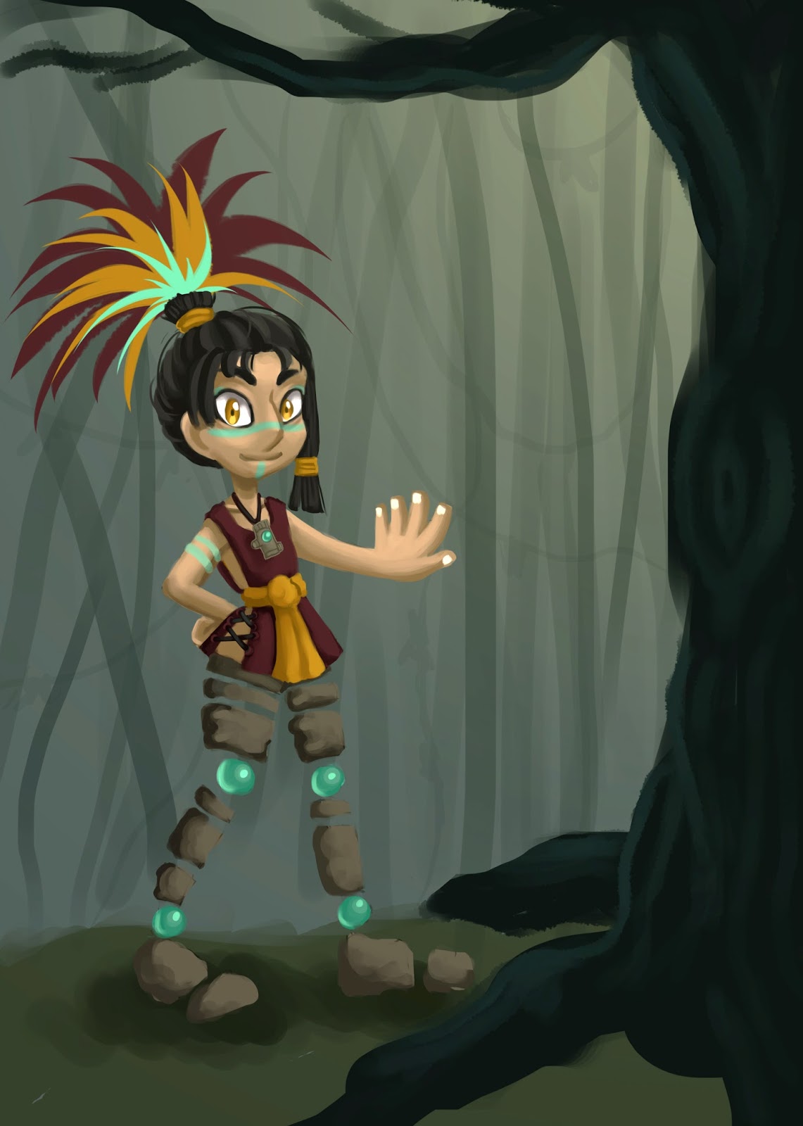
Once I had finished the design for the character in the PC version, I drew her in the simpler version for the mobile game. I also added less destales to her texturing so it doesn't get to busy. I made sure her main features where still present, like her flatter chest and bigger nose and eyebrows, to keep her recognisable. For this reason I also kept her outfit and hair the same. As her head is so much bigger, I made her feathers, hands and feet larger as well, to help balance out the proportions.


When modelling the character, I tyed to keep the poly count as low as possible, wile still keeping the shapes that where needed. Once I finished the body, I duplicated faces from the main mesh to make the hair and clothes.  I wanted these parts to be separate so they could be changed with customisable elements. 

For the texturing, I was going to use mostly block colours, then use the lighting to create the shadows and highlights, but I coden't get that to work right, so I desided to paint the dimentuns instead. Because of this, I uses a large PDF file first, so I could plain in the level of detail I wanted, then shrunk this down to the allowed size. I also put her clothing on a different texture map to alow more space to pain. But this also means that another clothing texture could be layed here, saving space all around. One problem I found was the way I cut the hair UVs. As part of her ponytail was cut with the rest of her hair, I couldn't get the two parts to line up correctly.


Overall, I really like the results of this character. I think her feachures work well for a low poly model and the texure map helps it seem more deataled. She did end up being more polys then I thought, but this was due to her rock legs being in so many parts. My UV layout could also be a little more compacted, but it is organizes in a way that similar parts are put together to make identifying them easier.


Finally, I rigged and posed the character so that I could put her into the screen shots. I used my sketch book studies and images from the internet to help get the limbs in the right places. There was a lot of problems when it came to doing the weights for the joints as they kept changing when I would set them. After a long wile I got the joints to work as well as I could get them, but I didn't want to spend too much time on this as she wasn't going to be animated anyway and there ware more impotent thing that still needed to be done. But because of this, when posing her, there where bits that would bend wrong or fold into itself. These problems weren't too bad so I desired to cover them up in photoshop. In the future, I defiantly need to practice character rigging.

30 Oct 2015

AAA Asset Assignment - Toy Carousel

For our tripe A asset assignment, I desied to make a toy carousel. I chose this as corosels are mostly sametical so I could do a lot of duplicating, but it still has a lot of small detales and separent parts that would make it interesting.


I chose this carousel as it had a nice diversity of matirales and many refrances photos from different angles. I also wanted to try making a reflective surface which is carousel has doted around.


Before starting, I decided to make a template for the main body of the carousel, as all the refrances where at an agle. I then used meany cylinders and esxrutions to make the basic shape. I then realied, as the deign around the bottom is repeated four times, it would be hard to keep them all identical if i did them separately. To solve this I cut a quarter of and made the design once, then duplicated and rotated it to comple the base. To make the flowers and the mirror, I used the quad draw tool to make the basic shapes, then duplicated to make everything smetical. I also tried to keep everything very simple, as then I could used the non smoothed version of the high poly as the low poly. I did have to flatten ou the mirrors on the top so that they use less polys, and I also delated edge loops here and there to keep the count low.

High Poly Modelling


Once I'ed finished the mesh for the high poly carousel, I worked on making the horse. To lessen the work loud, I desided to just make one horse, and then make multiple defuse maps for the different colours. I first, I thought it would be better if I try to make the whole horse out of one mesh. That way it will be easier to make the low poly, as I woden't have to wory about combining things after. However, this brought up many complications as making sure the edge flow worked all the way around way very hard. As I was making most of the components separately, I had to keep adding egde loops in places to make sure I could combined them. This became confusing and even made the topology of the horse really bad. In the end, I chose to start again from an earlier stage and made sure to make everything separately. Again, I made the mesh ferly simple and used the un-smoothed version for the low poly. I also removed the smaller details as they would be part of the normal map.


To create the finer textures like the leather and fabric, I used some alphas in ZBrush. I also used the spiel brush to make the spiels on the mirror, and the rake tool to make the hair on the horse. I also wanted to put wood paneling onto the bottom part of the carousel, but I couldn't get it to look right.


Finished High Poly


Quixel

Once I had finished the high poly and low poly models, I added smart materials in Quixel. I didn't remember how Quixel worked, so I used the sadle of the horse as a test. I remembered that every different marital needed a different color, but by doing this I also learnt that if I want something of the same marital to be a different color, it would need a different ID colour. I also exspremented with the different matirales to see what would work well. 


I used what I'd learnt in the test to make the real maps for my model. I tried to get as much as I could onto one UV Map, but as there was so many different components with different matirales, I desided to split the carousel into three parts and have one for the horse. I exported the seprent parts in high and low poly so that I could use XNormal to make the normal maps. I aplayed the maps and colour IDs to the low poly models in Maya to make sure everything was aliened properly. I continued to tweek it and move things around until I was happy with it.
I then put everything into Quixel. I used the reference images to help me chose the right matirales. I desided to use mostly plastics as it was sapost to be a toy. I used the paint marital for most of the colours as it looks hand painted, and then I used brass for the gold bits. I was going to use gold but that looked too shiny, and other metals woden't look gold eanouth when I changed its colour. I then used a sliver for all the mirrors, as that was the most refletive matiral, and a wood texure for the base. I would perfure to use a plastic as thats that the orinonal is made from, but as I coden't get the wood panaling on using nomals, I wanted the base to at lest resemble wood. The one matiral I codent get to look right was the glass. There was glass matirlas available but they didn't have the translucency that I needed. The biggest problem I found was that the normals for the mirrors on the top didn't line up properly. This may be because I had to move it around when making the low poly, so they may be in slightly different positions in the low then the high. I also over lapped the UVs of the mirror which may have also affected this.


Unreal

I haven't used Unreal before, but it was similer to making seances in Unity so I didn't find it too hard. I used the assets already in Unreal to make a small room to display the carousel in. I also made it sunset as the pinky colours suited the childlike carousel. I found a glass marital in the unreal assests so I used that for my light bulbs and put spot lights into them. I also added lights to the top ring to reflect the reference image. I also got the carosel to spin by adding a rotating tab to the middle part and horses.


Over all I really liked what I've produced. I feel, even though some of the matirales do look different from the reference, the overall effect is very strong. Doing this has help me to learn more efficient ways to make low poly models look to a higher slandered. Its also hepled me think more criticaly about diffrent matirales and what makes them different.